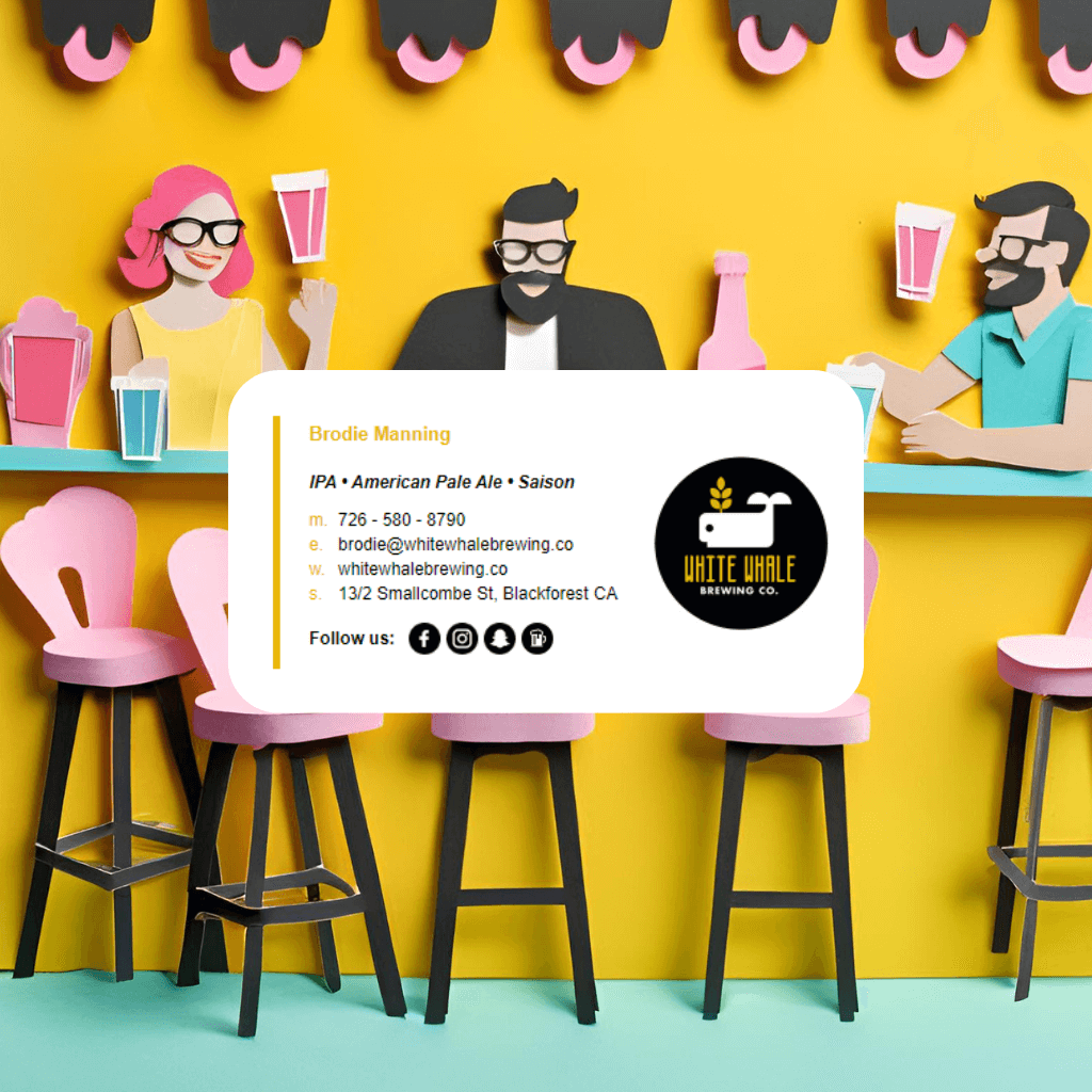
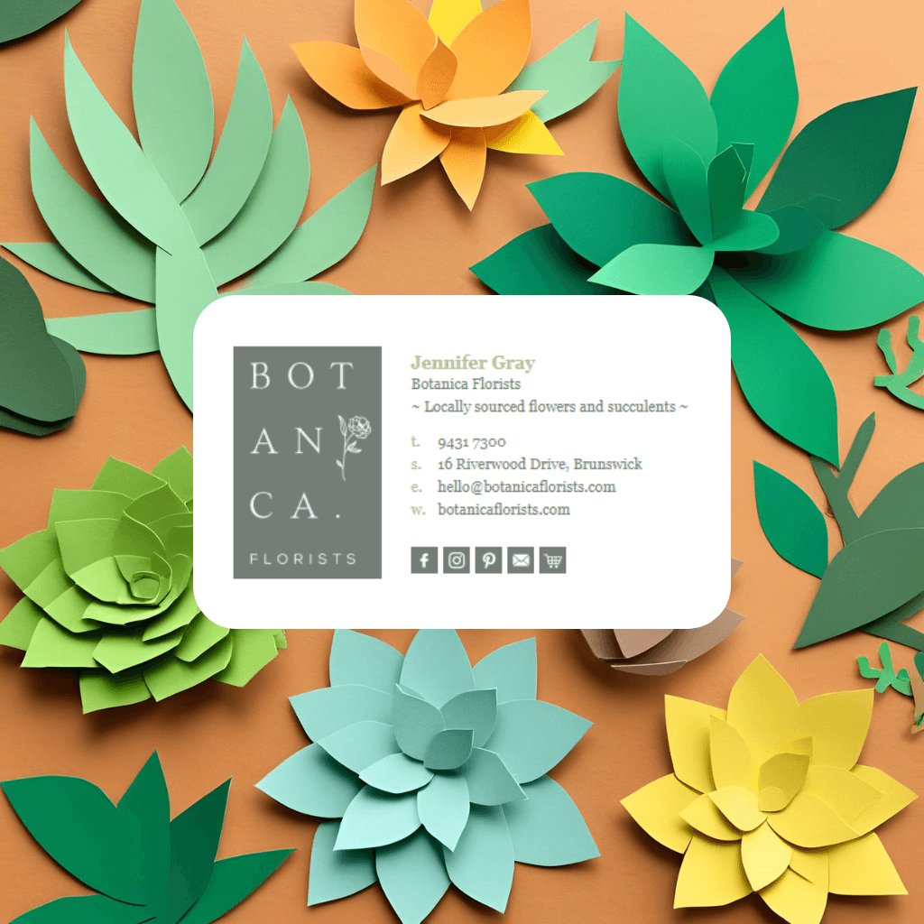
Here’s how to turn a basic HTML email signature into something that looks uniquely you - with concrete ideas, example elements, and tips to keep everything email-safe.
1. Start with your brand basics
Before you add cute design flourishes, lock in the core brand elements:
Logo
- Use a horizontal logo where possible (they fit better in signatures than tall logos).
- Keep the image width around 200–300px so it’s clear but not huge.
- Save as PNG for crisp edges, especially if you have icons or script text.
Colors
Pick 1–2 key brand colors and one neutral:
- Use your primary brand color for:
- Your name or job title
- Section dividers or lines
- CTA buttons (e.g. “Book an Appointment”)
- Use a secondary color sparingly:
- Accent icons (like social media)
- Tiny decorative elements or highlights
Too many colors = messy. Two strong brand colors used consistently = polished.
Fonts
Email clients are fussy, so stick to web-safe fonts:
- Sans-serif: Arial, Verdana, Tahoma
- Serif: Georgia, Times New Roman
Use a hierarchy:
- Name: 16–18px, bold
- Job title: 13–14px, regular or italic
- Contact details: 12–13px
2. Add “you” - personal identity and credibility
Make it clear that there’s a real human behind your emails.
Headshot (optional but powerful)
- Use a small, friendly headshot (around 80–120px).
- Keep it simple: neutral background, good lighting, no heavy filters.
- Round or slightly rounded corners can soften the look.
Role + specialties
Instead of just “Owner” or “Director,” try:
- “Senior Stylist – Blondes & Balayage Specialist”
- “Property Manager | Residential & Commercial”
- “Senior Lawyer – Family & Estate Law”
This instantly personalizes your role for your business and niche.
Credentials & trust signals
Add 1–3 maximum:
- Certifications (CPA, RN, JD)
- Awards (“2024 Local Business Award – Gold”)
- Memberships (REIA, Law Society, etc.)
Keep these on a separate line or in a small sub-row so they’re easy to scan.
3. Use custom decorative elements that match your business
This is where it starts feeling truly custom. Think small and purposeful.
Decorative icons & mini-graphics
Instead of generic lines and dots, use mini-icons that relate to your industry. For example:
- Hairdresser / Barber
- Scissors icon as a divider between name and contact info
- A thin line ending with a tiny comb or hairdryer symbol
- “Book now” button with a subtle scissors icon on the left
- Real Estate Agent
- Tiny house or key icon near your name or tagline
- Row of 3 dots where the center one is a house icon
- A thin line with a little location pin at the end
- Lawyer / Legal Firm
- Small scales of justice icon
- Thin line divider with a subtle column/pillar icon
- A refined monogram (e.g. “MW” for Martin & White)
- Health & Wellness / Clinic
- Leaf, heart, or cross icon
- Soft, rounded line with a small icon at the center
- Mini “patient first” badge icon
- Creative / Designer / Agency
- Pencil, brush, cursor, or star icon
- Abstract shapes (circles, dots, lines) in brand colors
- Small “Made with ✶” style accent under the banner
These should be small PNGs, placed in <img> tags, sitting inside simple HTML tables so they display reliably.


